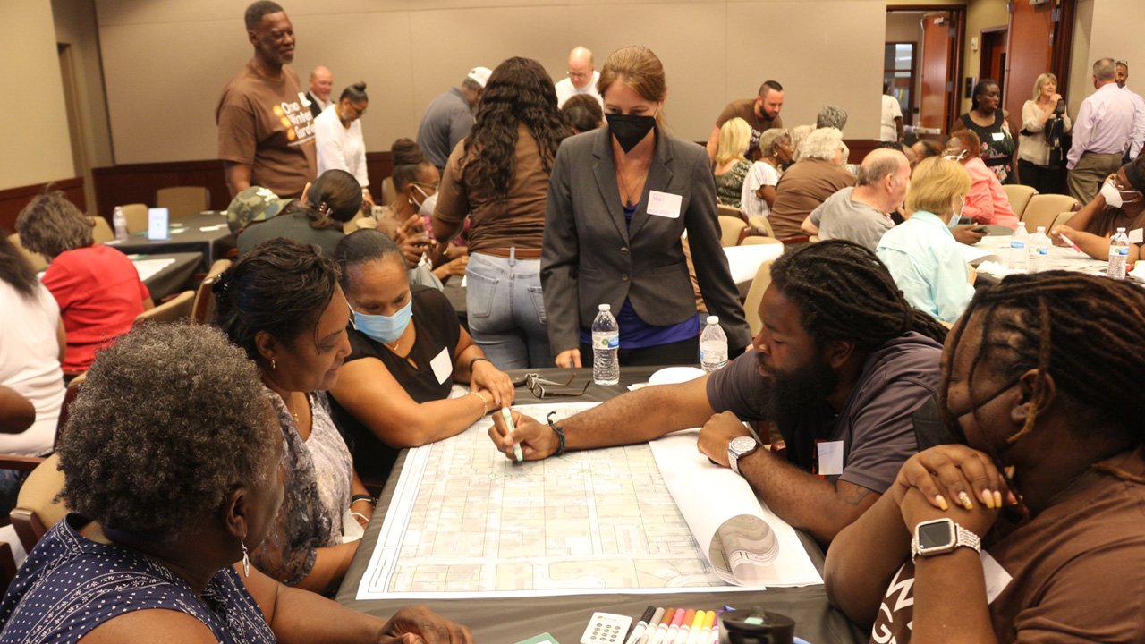
This week, the City of Panama City, Florida unanimously passed a Complete Streets resolution as called for in the Long Term Recovery Planning Project the City undertook in the wake of Category 5 Hurricane Michael. The Panama City Neighborhood Plans Strategic Vision, which Dover, Kohl & Partners designed in 2020, laid out a framework for recovery based on the community's vision for an equitable and resilient future post-Hurricane Michael. As part of this resolution, the City mapped out context classifications for all of its streets which will help get the City and State on the same page when it comes to designing streets for everyone, not just cars. Congratulations to the City of Panama City!
We're growing!!!!!!
Job Opening: Urban Designer & Town Planner.
Salary: $70,000 to $80,000 DOQ
Job Description
Dover, Kohl & Partners Town Planning works nationwide in the fascinating intersection of planning, architecture, real estate development, street design, preservation, sustainability, equity, and housing policy. We are seeking a new full-time team member to work in our Miami-area studio as an urban designer, planner, and Project Director. You will be involved with urban design projects, master plan documents, drawing, writing, participating in public events and client meetings, project administration, GIS and illustrative mapping, 3D modeling, research, promotion, and graphic design. This position is suited to individuals deeply interested in more walkable, inspiring, inclusive communities. This is an ideal job for a person that enjoys people-centered, citizen-driven planning processes.
Experience & Qualifications
This next-level position is suited to an individual with 5-10 years of experience and academic background in a field related to the built environment. Credentials such as advanced degrees, CNU accreditation, AICP certification, Form-Based Codes Institute and/or National Charrette Institute training, Climate Reality Leadership Corps training, or LEED accreditation are helpful.
Travel
Your job will likely involve travel responsibilities from time to time, to work on-location with communities and clients in charrettes or similar events.
Location
We are open to hiring for an in-person position for someone working in our Coral Gables studio, or a remote-worker position, or a hybrid of the two, all depending on the strengths and experience level of the individual.
Salary & Benefits
Starting base salary for this position will range from $70,000 to $80,000 per year, depending on experience and qualifications, and will be re-evaluated within six months. You can anticipate that occasional extra pay for certain out-of-town design charrettes (“charrette pay”) will add to your salary. Your benefits will include full major medical health insurance and a gap insurance policy, paid in their entirety by the company, if you choose to join our group plan. Our company also has a pension plan with employer-match contribution; you will become eligible for the pension plan after two years of employment. You will be entitled to eighteen personal days and paid holidays each year. Benefits may also include reimbursement for moving expenses and a signing bonus to be paid on your first day at work. Florida residents do not pay state income taxes.
Open to All
Dover, Kohl & Partners is an Equal Opportunity Employer. We do not discriminate against any employee or applicant for employment because of national origin, religion, race, color, age, marital status, sexual orientation, gender identity and/or expression, status as a veteran, or disability.
Prospective interviewees should send resumes, and links to online work samples, to info@doverkohl.com.
Onward Alameda Unanimously Approved by El Paso City Council
Onward Alameda, the plan for the Alameda Avenue Corridor in El Paso was unanimously approved by the El Paso City Council on June 22, 2022. Dover, Kohl & Partners presented on behalf of a multi-disciplinary consultant team that included Gallinar Planning, CEA Group, and Street Plans Collaborative. The Alameda Corridor has historically been one of El Paso’s most vital corridors but it has seen years of decline. Alameda Avenue connects downtown El Paso to the Mission Valley and then continues beyond the City to communities further along the Rio Grande River. The City of El Paso grew east along Alameda. Today the corridor hosts one of Sun Metro’s Brio Rapid Transit System routes and it is time to build new Transit Oriented Development which adds to the quality of life of East Side residents.
Amherst, NY Boulevard Central District Plan Wins 2022 WNY APA Outstanding Planning Award
Dover, Kohl & Partners is proud to announce that the Boulevard Central District Plan in Amherst, New York is the recent recipient of the 2022 Planning Award for Comprehensive Planning from the Western New York section of the American Planning Association. The award recognizes the project as contributing to the elevation and advancement of planning in the Western New York region and as a step to making communities stronger and more resilient. Congratulations to the Town of Amherst and for all those involved in the planning process -- it is an honor to be a partner in such an important transformation in the life of the town.
DK&P worked with the Town and community stakeholders in 2020 to create an Action Plan for the retrofit and redevelopment of the district. The area exhibits characteristics typical of suburban development found throughout New York and the United States. Commercial areas have been developed with primarily single-use office or retail uses, surrounded by surface parking lots. The Town of Amherst envisions the Boulevard Central District as a walkable, mixed-use, transit-oriented area, with its existing suburban commercial areas retrofitted incrementally over time; a Mixed Use Zoning Code was adopted to shape future development.
The DK&P team created plans and illustrations to test the code, demonstrating how the area can transform with a new network of streets and public spaces and future mixed-use development on key sites. An expanded street network framed by building frontages creates smaller, walkable blocks to provide interconnectivity among residents, businesses, and surrounding areas. Enhanced transit travels along tree-lined, multimodal, complete streets. Parks and community gathering areas are integrated into the overall pattern of development. The Action Plan identifies public and private action steps to realize this vision, and transform the once retail dominant space into a true mixed-use district, creating great addresses and vibrant center for all to enjoy.
DK&P Returns to East Winter Garden, FL to Work on an Equity-Focused Plan
Urban planners from Dover, Kohl & Partners met with East Winter Garden residents, business owners, and community leaders over three days to get input about their visions for community revitalization. The City of Winter Garden revisited The East Winter Garden Plan (2017), a community-directed, city-funded, 20-year plan that was begun in 2017. The City’s Community Redevelopment Agency (CRA) has pledged to spend 75 percent of its funds on the historically African-American community and that could mean between $20m and $40m of public investment over the ten-year life of the CRA.
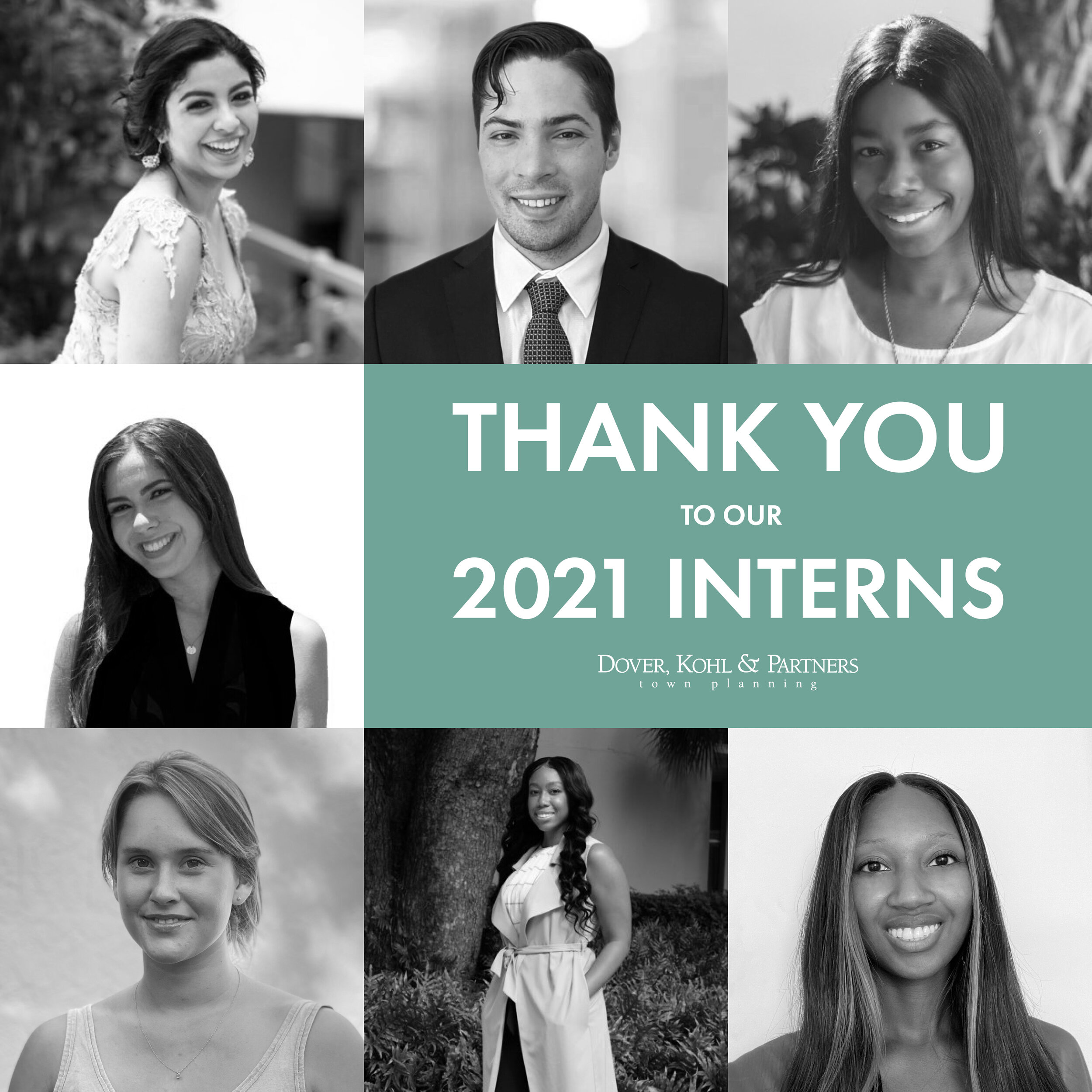
THANK YOU TO OUR 2021 INTERNS [Now accepting applications for 2022]
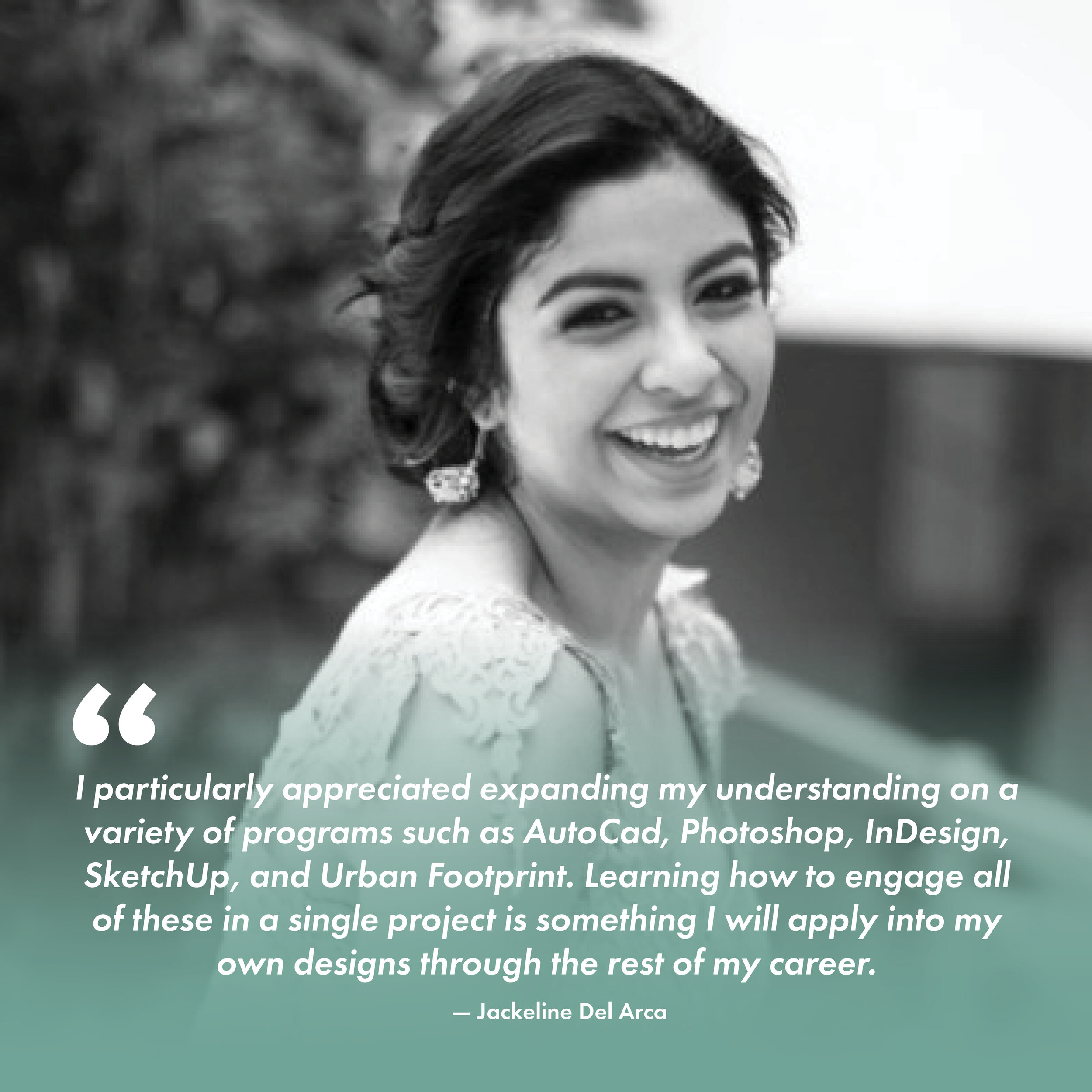
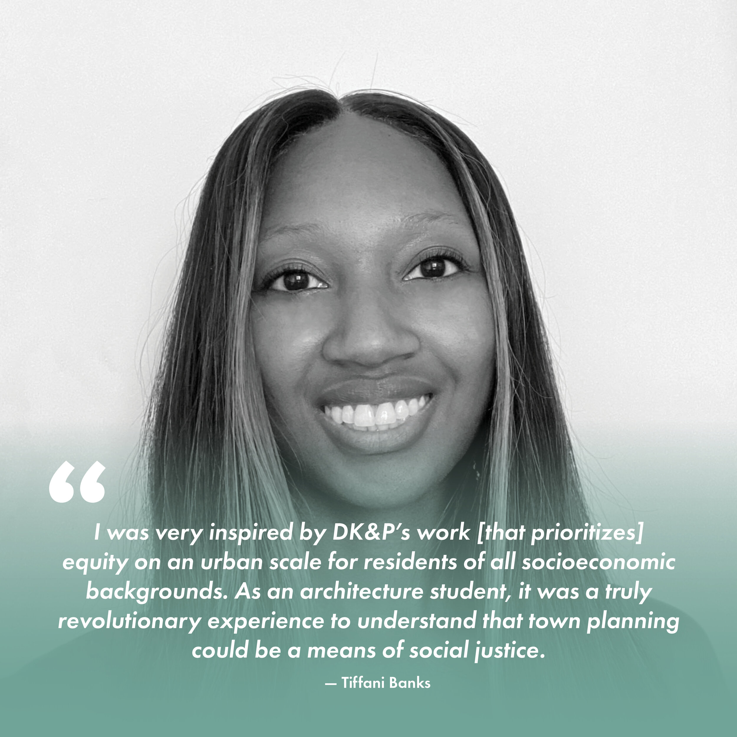
Thank you to our 2021 interns for their incredible work and flexibility over the last year. While we all wished to be physically in the Coral Gables studio the full length of the internship, you managed to produce high-quality, professional-grade work virtually and geographically distanced. To say we’re impressed would be an understatement.
We at Dover, Kohl & Partners answered the challenge of hosting interns amidst a pandemic by organizing a series of virtual trainings and educational sessions. We also provided hands-on experience with real-world clients. For those that were able to join us physically toward summer’s end, DK&P led walking tours throughout South Florida where we analyzed historic neighborhood designs, critiqued an ongoing rails-to-trails project, and imagined a brighter future for the Commodore Trail.
Now, we’re accepting applications for 2022. Each year, we welcome a limited number of student interns into our interdisciplinary studio to join in on the work of making better cities and towns. Coming from varied hometowns and academic backgrounds—and from numerous fields of study related to urbanism—our interns tackle challenging real-world design, development, research, public outreach and communications tasks. Interns do creative work, sit in on client meetings, and help run designing-in-public events right alongside our fulltime staff. It's not unpaid work; our interns earn a modest beginner salary while getting firsthand experience with a dynamic, fast-paced wing of the planning and urban design professions. Many of our fulltime staff members first began working at DK&P as student interns.
Between now and December 1, 2021, we'll be reviewing student portfolios and begin notifying interns selected to work in our Coral Gables studio for 2022.
Submit your letter of interest, dates of availability, and examples of your recent work to
info@doverkohl.com
Work in Progress: New Oaks Pocket Neighborhood
We’re working on the zoning for a new “pocket neighborhood” in Lake Wales, Florida. More info coming soon.
Should our town build this "pedestrian bridge"?
The way you design a street matters, and what you build along it and overhead matters, too. All these send messages about our priorities and values.
Our town of South Miami is pretty cool, with the only traditional main street just across US Highway 1 from both the Metrorail and the future Underline linear park/bikeway. There’s a debate raging locally about whether to build a “pedestrian bridge” arcing over US Highway 1, the six-lane street that splits South Miami into two pieces where we really need to unite them. But is a ped bridge the way to do it?
A city commissioner asked neighbors to weigh in on the ped bridge idea, so here are my notes:
1. Design matters.
If a pedestrian bridge is a done deal, and no amount of reasoning or budgeting can dissuade our leaders from building it, then at least make it excellent.
Seeing the two architectural renderings recently, a) one senses that the decision to have a bridge might already have been made, and b) if it is inevitable, a lot more work needs to go into the design. I decided to make this point #1 in case none of the other points below withstand your scrutiny. But please, consider skipping ahead first and then coming back to read the rest of this paragraph.
If there has to be a bridge, you must recognize that this architectural feature will be forever imprinted in the minds of everyone as the gateway to and symbol of the city. Can’t it visually have something to do with its context? It should be classic and timeless, or it will look dated in no time. It must not look corporate. It should be designed to look good even when it gets wet and weathered and when a mix of rain and tailpipe exhaust streaks down it. It should feel gracious and generous, not cramped and cheap and expedient. Most of all it should feel sturdy and confident, not trying to defy gravity or pretend weightlessness over such a long span. Given that at the SW 71st Street crossing location there is a median in the center of US1, one wonders if a two-span structure supported by a center tower might make a better composition and a more doable project; that deserves exploration.
Rarely, but sometimes, a bridge is appropriate.
But…
2. A terrible highway or a grand signature avenue?
A real city must never abandon movement by people on the ground plane. A real city is experienced at ground level. In Charlotte, as in many other cities, experimental 1970s pedestrian bridges have been removed. We will never recover US1 as a proper avenue if the idea is that the ground level is for cars but people on foot (and bikes?) are supposed to be in the sky. How can the City demand that redevelopers along US1 devise buildings that have doors, windows and storefronts facing US1 (like in any mature city—and like the Holsum Bakery historically did, facing US1), instead of parking garages, blank walls, and back-of-house functions, if by constructing bridges the City makes obvious its belief that US1 is just for cars?
3. Keep the at-grade crossings. Pledge to upgrade them.
Under no circumstances should the at-grade crossings at Sunset Drive, SW 70th Street and Red Road be compromised or fenced or traded-down in any way just to get people to use a bridge. Instead, those crossings should be intensively upgraded, a new one created at SW 73rd Street, and much better ones installed at SW 62nd Avenue and SW 80th Street. Given the record of breakdowns of elevators at our Metrorail stations, I find myself banking on crossing at grade pretty often whether there’s a bridge or not, and I bet a lot of folks in wheelchairs feel the same way. Imagine the objections over compliance with the Americans with Disabilities Act once someone counts the number of days per year the aging elevators are out of order—especially if by then the at-grade crossings are officially discouraged.
4. How should we spend money?
The bridge enthusiasts include a lot of motoring-only people who rarely walk and bike even less. If they did, they’d understand why ped bridges rarely work as intended. But ped bridges are like Homer Simpson’s monorail: They are fancy showpiece infrastructure that’s ridiculously costly, yet somehow curiously popular in the idea stage, despite being almost impossible to implement and maintain, partly because they are in reality hardly worth the trouble. This bridge in particular has become a safe harbor for political figures. Motor-voters get all excited and say “Yeah, let’s do it” and then, well, if it isn’t really workable, practical or affordable and doesn’t get done, then the commissioner can say It’s Not My Fault. (“Sorry, we didn’t get the grant.”) But if it does get built and is seldom used or looks bad or cracks or worse, they can blame the county, FDOT, or the architects. This safe-either-way formula has led us to the place where at least two city commissioners built their campaigns around their pro-bridge platform. I’m realistic enough to realize it may be futile to point out the shortcomings of the bridge idea anymore. But just in case: Do you want showpiece infrastructure that is really worth the trouble and money and actually makes things better? Redesign the streets. Plant trees.
5. Design speed matters.
There’s no disputing that today the intersections are too uncomfortable and perhaps genuinely dangerous [see the Dangerous by Design interactive map, which documents one fatality since 2008 at Sunset Drive (in 2018) and two fatalities at Red Road (in 2017)]. But so is the street in between the intersections. At least one fatality involved not crossing US1, but merely walking along it. US1 is alarmingly too fast, and yet so much focus is given to the peak hour capacity and shortening travel times. County officials celebrated the recent installation of advanced automated signal timing on US1, which squeezed extra peak-hour capacity out of the intersections (as long as you were trying to drive along the road, instead of walking, biking or driving across it). Working within the limitations of the existing number of lanes (six! plus turn lanes) they managed to wring out improved drive times from down south to downtown. It’s impressive technology. Yet I ask, were any of the minutes saved along the corridor used to expand the crossing signal times for pedestrians, anywhere? Or did all the benefit accrue to motorists alone?
Meanwhile, consider the rest of the day and night. All that asphalt is a clear invitation to excessive speeds in the off-peak times. When someone makes a mistake, whether they are drunk or not, their high speed ups the mayhem. We take it for granted that US1 is forever meant to be a super-speedy facility. We shouldn’t. Here’s why:
When a motorist driving 20mph makes an error and strikes a pedestrian, the result is a fatality 5% of the time. When they are driving 30mph, the result is a dead pedestrian 45% of the time. At 45mph, the motorist kills that pedestrian 85% of the time. Car-on-car collisions are similar in that the higher the speed, the worse the injuries and fatalities. That is why 40,000+ people a year are dying in the streets of the United States, and our state, with its Teflon-coated roads, has the worst record in the nation in this public safety crisis.
Don’t get alarmed, commuters. Yes, I said slow down US1. Speeding up just to catch the taillights of the car in front of you at the next traffic signal might feel satisfying, but it doesn’t get you to your destination any faster. That’s because at around 26 or 27mph, we get the most efficient use of a lane, that is, the most cars past a point in space per hour; go any faster, and as you spread out, you eat up any gains. Traffic engineers will admit this; if you want to look it up, start by searching for “Speed / Flow Capacity diagram.”
Where did all those commuters from way down south that ream their way through South Miami twice a day come from, anyway? They are the embodiment of a cold reality: the statewide program of building wide, fast roads (instead of transit), in hopes of making it possible for motorists to freely flow, has only encouraged them to roam farther. Widening roads like US1 facilitated the sprawl. It’s called Induced Travel Demand. Traffic engineers will admit this too. It is why US1 should never have been widened so much in the first place. Ultimately, we should investigate repurposing a couple of those lanes. But that is a topic for another post.
So: Why is the big idea getting pedestrians up in the air away from our streets, instead of slowing down the cars to a reasonable pace? Because these bridges are not really built for the benefit of pedestrians:
6. These bridges aren’t really “pedestrian bridges.”
They’re structures built as band-aids after the streets of a city are savagely deformed for cars, built after the fact to give lip service to pedestrian friendliness. But insidiously, they usually become an excuse to further reduce the red-signal time for motorists on the highways they span. The pedestrian bridge is all about getting pesky pedestrians out of the way so motorists can zoom along without waiting so long for humans to cross. If South Miami’s debate were really about making humans happy on foot, there’d be an accompanying campaign to plant street trees on the bland, bald streets that lead to our Metrorail station and these very intersections.
Green time on US1 has long been the transpocracy’s only priority; that’s why the “Go” signal phase is so short and infrequent for pedestrians. If our local and state governments want to send a powerful message that pedestrian comfort and safety are the top priorities, more important than pass-through “throughput capacity” for outsider motorists, then
redesign the meager at-grade crossings for high visibility,
lengthen the duration of the “Go” signal phase for US1 pedestrian crossings (which just requires tweaking dials on a computer), and
plant a lot of street trees and improve sidewalks.
If our governments want to send a powerful message that safe and comfortable cycling is a priority, then retrofit Red Road and other streets with protected bike lanes.
These measures can all be accomplished at a fraction of the cost of a single pedestrian bridge.
7. Bridges aren’t as convenient and direct as people think.
The newest proposed alignment for a bridge at SW 71st Street, if it fits at all between the Metrorail dripline and the US1 curbline, is one-third better than previous proposals, if on its west end it includes a direct entrance/exit from within the Metrorail station to the bridge elevator doors, with no looping around. (However, that means a solution will have to be found for those on foot or bike who are not coming from or going to Metrorail, and thus can’t enter the station, and will have to loop around.) Then, once one exits the bridge on its east end at 71st Street, where will they be? On a sad, car-dominated alley. 71st Street is (at least today) a half-built nowhere with deeply-setback one-story buildings poking out of parking lots—where our pedestrians will find there’s no clear route to the main attractions on Sunset Drive and 73rd Street. If there is to be a bridge landing here, at least the City should couple that with a concerted redevelopment/infill effort. Someday, if they ever follow the Hometown Plan, 71st Street will be great. But it’s not, yet.
Meanwhile, can we reasonably expect walkers who are already crossing directly to the attractions at Sunset Drive to go out of their way north to the 71st Street bridge, wait for an elevator, cross, wait for another elevator, and then double back to Sunset and Dorn Avenue? See “Keep the At-Grade Crossings” above.
8. The space is really, really tight. Expect delays.
The distance between the dripline of the Metrorail northbound tracks and the curbline next to the southbound lanes of US1 is very, very small. Fitting a structure with an elevator, stair tower, landings and so forth in that space might not be impossible, but it will be like threading a needle if it’s doable at all. To implement it, this will require the closing of one or more lanes of traffic for an extended period during construction. (Add up all that delay, over many months, and compare it to adding a few seconds to the “Go” signal phase for pedestrians at SW 72nd Street and SW 80th Street. Apparently, we are willing to slow down motorists on US1 after all.) In addition, implementing this bridge in such tight quarters could also require realigning the whole of the road itself to correct lane widths and get enough space. (Add up that delay too.) In that case, shouldn’t we just fix the whole street?
If lane realignment turns out to be the solution, why not go ahead and redesign US1 as a beautiful, crossable, tree-lined avenue in the first place, instead of building a bridge? Or at least, worst case, in addition to building a bridge? Lane realignments do happen, even on an FDOT facility like US1, as we saw recently just south of Douglas Road in Coral Gables.
9. Divider or seam?
Transportation expert Jim Charlier (Google him) famously quipped that “the primary benefit of `pedestrian’ bridges is to provide shade for the pedestrians that will insist on crossing down below at grade.” Since crossing in the sky is an unnatural act, traffic engineers devise ways to force people to do it. One common way to force more users onto a bridge is to fence off the at-grade alternatives, as has been done at the other intersections near bridges on US1, including at Mariposa. This sends a terrible message: Drive as fast as you want on US1—we’re keeping the regular walking-around folks out of your way.
For years people would sprint through the bushes under the Vizcaya “hamster” bridge rather than use its uncomfortable, indirect route; the transpocrats eventually kept adding layer upon layer of fortification to prevent this, feeling that the close proximity to the I-95 terminus left them with no other options.
But if the reason to build a bridge in South Miami is to symbolically unify the two halves of our city, but then we allow the agencies to fortify and wall off our city in this way, we will end up with an even more divided, more fragmented city instead. That’s the opposite of the goal and of the message we want to send. If we want to unify the city, we have to convert US1 from a divider into a joint or seam. The way to do this is to redesign US1 as a beautiful, tree-lined, grand, signature avenue.
10. Misreading the scale.
A six-lane street can be made reasonably crossable at grade. Many of the grand tree-lined boulevards of Paris have even more lanes; the Champs-Elysees is sixteen lanes wide. Michigan Avenue in front of the Chicago Hilton is seven lanes wide. Yet crossing from the Hilton to Grant Park feels perfectly natural, like pedestrians are meant to do it.
Peering through their windshields, some people in South Miami tend to assume a six-lane street is too hard to cross because they see the cars moving through the intersection on the green signal are driving too fast, the lanes are too wide, there is no legit mid-crossing refuge, and (this is the crucial point) the pedestrian “Go” signal phase doesn’t last nearly long enough. Let the pedestrians decide.
11. One more risky bridge?
An effective way to make national news headlines is for a bridge to fail. (Google “FIU bridge tragedy.”) Another is to have a viral story about a person leaving the elevator and getting mugged midspan, trapped by two or more cooperating criminals coming from opposite directions. Short of placing a security officer fulltime in the bridge itself, or manning an ungodly number of cameras, how can this be prevented?
12. Is there ever a time or place where ped/bike bridges are appropriate?
Yes. There are places where continuity and functionality for those walking and running and biking on trails simply can’t be obtained without a grade-separated bridge. Constructing the bridge on the Underline/M-Path over the Snapper Creek Expressway entrance was appropriate; when it was built, it solved the notorious “Dadeland Gap” for cyclists on the East Coast Greenway. The West Orange Trail has a very effective bridge over Florida’s Turnpike, where the pedestrian realm at grade has already been permanently surrendered. Our own design for the Ludlam Trail has bridges over corridors where continuity demands it (but in addition to, not instead of, excellent at-grade crossings). And who can forget the Ponte Vecchio in Florence (over a big river) or the Rialto in Venice (over a big canal), both destinations in themselves? But here are the problems: Downtown South Miami isn’t one of those situations where functional crossing is impossible at grade, and US1 is not irretrievable for pedestrians like, say, the Turnpike. Squeezing in an elevator-only bridge at 71st Street between the Metrorail and US1 where users have to go out of their way to snake around to it isn’t going to create continuity, it’s the opposite. Other locations that have been explored upstream and downstream have even worse disadvantages.
13. Would this use all of our City’s PTP (CITT) funds? What’s the funding plan? How does it reflect our values?
It has been said that the City’s whole share of funds from the Peoples’ Transportation Plan / Citizens Independent Transportation Trust, for many years running, would have to be used to finance the bridge. If confirmed, that would mean those special sales tax funds are no longer available to run the fabulous Freebee electric shuttle, or to make crucial citywide improvements for walking or cycling, or to renovate Sunset Drive as part of downtown revitalization, or to implement the rest of the City’s Intermodal Transportation Plan. That would be a bad trade.
—Victor Dover FAICP
Lake Wales Connected wins 2021 “Plan It” award and Jan Johnson Public Participation Award
Last Friday at the annual meeting of the Heart of Florida Section of the American Planning Association, the Lake Wales Connected plan was presented the 2021 “Plan It” award and the Jan Johnson Public Participation Award. The awards recognize DK&P’s visionary strategy for revitalization of Lake Wales’ central core, the interactive community engagement process used to create the plan, and the implementation efforts the City has undertaken over the past year.
For more information, check out Lake Wales Connected.
Lincoln Institute on DK&P and the first generation of digital, "virtual charrettes"
Revered in planning and public leadership circles, the Lincoln Institute of Land Policy reported recently on the shift to online events for city planning, spotlighting a recent “virtual charrette” produced by Dover, Kohl & Partners. Read “Will the Pandemic Change the Face of Public Meetings Forever?”in the Institute’s journal Land Lines here.
The weeklong digital series of interactive planning activities for the Mullan Area in Missoula, Montana, may well have been the world’s first entirely virtual design charrette, according to The Charrette Handbook author Bill Lennertz, founder of the National Charrette Institute. More than 800 viewers tuned into NCI/FBCI webinar, “Charrettes Go Virtual,” in April.
How it Happened
Dover, Kohl & Partners traveling studio team were packed and ready to fly west to Montana for the charrette when the pandemic stay-at-home orders made that trip impossible. Yet a federal funding deadline for key infrastructure made a delay unworkable. With a week to go, our team mounted a huge, high-stakes effort to convert the charrette to an all-online format, advertise the change, and build a toolkit for digital collaboration. The result was impressive. A great many people have touched, scrutinized and influenced the plan— from the safety of their homes— and the Mullan documents are compelling (and were delivered on time and on budget). Engagement included:
280+ “virtual studio” visitors and meeting attendees;
2,400+ views of the YouTube films;
900+ digital communications, survey participants, interactive tools, social media likes & followers;
18,000+ website views; plus
32,000+ of what ad agencies call “trackable media impressions.”
“The Mullan charrette required fast, on-the-go adjustments to many of our customary ways of doing things, while establishing home offices at the same time, and all week we were evolving the new approach as we went— sort of like that old saying, `building the plane while flying it,’” says DK&P founding principal Victor Dover. “We’ve quickly learned a lot about what really works.” Since the Mullan charrette, the DK&P design teams have held full-blown virtual charrette events for several more public and private clients, including the historic Florida cities of Neptune Beach and Panama City. Watch “What is a Virtual Charrette?” from the Neptune Beach video playlist, here.
Building on the Experience
This has turned out to be a period of intense creativity, experimentation, and ingenuity despite the obstacles of the pandemic and working remotely from our far-flung homes in South Florida, New Jersey and Budapest. It’s motivated us to ramp up the full power of computer tools we’ve been using for years and fuse those with new ones, and to stretch the now-ubiquitous videoconferencing formats to their limits for visualization, rapid prototyping, and public engagement. Our approach has rapidly widened “beyond Zoom,” to include livestreaming via YouTube, low-tech telephone town halls, “Chat With A Planner” buttons on the project websites, “virtual office hours” for in-depth discussions on design details, live smartphone polling, and, increasingly, accommodations for sight-impaired and hearing-impaired individuals. We’ve been pairing these online tools with on-the-ground components, too, including traditional paper surveys to bridge the digital divide and storefront exhibits designed to allow safe, socially distanced viewing of the many visual exhibits produced during design projects.