Street Design

Work in Progress: Warren Park – Northwest Arkansas Newest Mixed-Use Neighborhood

An integrated stormwater canal within the North neighborhood of Warren Park. Dover, Kohl & Partners, 2022

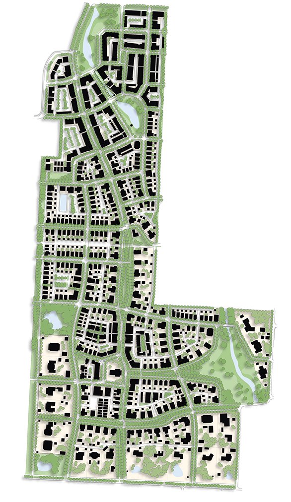
Warren Park Illustrative Plan

A subtle slough wandering through the hay bales, a vast and dancing meadow of wildflowers, and a perfectly pale blue Arkansas midday sky met the Dover, Kohl & Partners team as they first started laying out the future for 197 acres of Northwest Arkansas pastureland. The Warren Family farm’s natural charms and connectivity to Rogers, Bentonville, and the Razorback Greenway together make for fertile grounds in planning the next great NWA community.

The Dover, Kohl & Partners-led design is essentially two, five-minute neighborhoods large – one North and one South – taking advantage of the existing topography and canopy to create accessible urbanism for a wide variety of households and businesses interlinked through public space.  This “Village of Gardens” is inspired by the many great historic American planned neighborhoods of the early 20th Century and their European originations. Places like Mariemont in Ohio and Forest Hills Gardens in New York with their view-framing street deflections and grand public greens or the classic architecture of the Cotswolds and Bath that inspired them in turn. These examples create the foundation for settling a town in the rolling foothills of the Ozarks and are just as relevant to Bentonville as they are Bruges with a strong organization around site context and architectural regionalism.

View from the boutique hotel balcony toward the canal biergarten and event space

Both neighborhoods of Warren Park are centered around public spaces framed with fine-grained building fabric. The northern neighborhood features the more active and commercial areas of the mixed-use program bikeable via the Razorback Greenway and a separated cycletrack. This new Main Street runs a block away and parallel to the existing shallow stream now activated and compressed with canal-front restaurants and boutique hotel rooms while expanded on either end with floodable, passive stormwater parks. The larger of the two stormwater parks lies uphill and when dry serves as a commons for the nearby community center and crescent units on its perimeter.

Grand estate lots are set near the southern neighborhood edges in Warren Park, coupling with long views in public park spaces

Curbside cycletrack along the new mixed use Main Street section of Pinnacle Hills Parkway

The southern neighborhood is centered on a traditional square – complete with a site for a place of worship, grand estate homes, and “missing middle” cottages. The central square and the church project just enough into incoming streets and the network of green spaces to be seen from several blocks away in many different directions. Estate lots on both sides of the neighborhood contain a variety of outbuildings, and on the west side of the neighborhood, face a perimeter trail. Where both the South and the North neighborhood meet, they are joined by West Street, which is designed with a third line of canopy trees shading a multi-user trail; deep front porches will face towards the bikeway.

The Dover, Kohl & Partners team is proud to introduce the plan and some of the inspiration behind it.

Several public spaces will offer unique addresses in the northern neighborhood of Warren Park

A view looking east down West Drive shows its shaded trail, a key connection to the Razorback Greenway

Street-Oriented Architecture (TPS Ep. 11)

Places where people like to be ALWAYS have street-oriented architecture. Have you had enough of the blank walls, garage doors, and parking lots along your si...

Perhaps the key distinguishing feature between vibrant urban places and the drab scenes Jim Kunstler once called “the geography of nowhere” is this:

Places where people like to be always have street-oriented architecture. The buildings are engaged with the street in some legible, designed way; there’s an indispensable building-to-street relationship that feels mutually reinforcing.

Anatomy of a main street storefront building

The street space, that “public room,” extends from building face to building face—so the way individual buildings are designed affects, and even creates, the experience we have in that space. Many traditional building types, lot layouts and architectural grammar evolved as they did for precisely this reason; they dependably create a good experience and present each building to its neighborhood in a respectable manner.

For example, porches within conversational distance of the sidewalk give houses a neighborly sociability, and provide an agreeable intermediate layer of space between the fully public street and the fully private interior. On intimate streets of rowhouses, stoops and dooryards leave no doubt about where the front façade of the building is.

The finished floors of most rowhouses in Old Town Alexandria are elevated above the sidewalk level for privacy.

In most cases, an elevated finished floor level on the first inhabited floor is useful because it gives the interiors of rowhouses and ground floor apartments an extra degree of privacy and dignity, offsetting the fact that they are so close to the public realm. If you’re walking by outside along the sidewalk, and the inhabitants have their curtains and shutters open, you might see their chandelier, but you won’t be staring at them sitting on the couch or seeing what they’re watching on television! You won’t feel like an intruder, and they won’t feel intruded upon. But here’s an important caveat: In our times, we also need to be sensitive when applying this traditional detail, by also making accommodations for accessibility and visibility. The traditional elevated finished floor makes access difficult for those in wheelchairs or with mobility impairments, so shared ramps, lifts, zero-step entrances into spaces below the piano nobile, slightly elevated alleys, and roll-in lobbies can all be employed.

Storefront buildings on King Street in Old Town Alexandria, Virginia. Small details of architectural grammar matter.

On commercial and mixed-use streets, well-designed storefronts are the key. Consider the anatomy of a traditional Main Street building. Again, the details of architecture intermediate between the public spaces and the private interiors. Awnings, arcades, colonnades, galleries and other appurtenances help us deal with the sun and rain, but they are also ways the architecture reaches out, engages with, and embraces the street space. On the most successful streets, there’s always a clear front door to each building, facing the street. Having frequent doors along the street reinforces the scene.

On main streets, mixed-use buildings should usually have an expression line just above the ground floor, such as a cornice or eyebrow, forming a base that separates the private upper floors from the public world of the commercial street scene below.

#WhatNotToDo

Now, compare all that to deep setbacks, parking lots in front, or to rows of garage doors and “snout houses,” and to blank walls. This soul-destroying pattern became commonplace in late 20th Century suburbia, yet it’s never been shown to work well at making a people-friendly place or street scene—not even once! By contrast, in traditional urbanism, pleasant streets and street-oriented architecture support each other, time and again. When the streets are hostile, we’ll invariably find buildings retreating from the street, recoiling, turning their backside toward the neighborhood.

#whatnottodo

Chattanooga. Photo: Kenneth Garcia

It’s not a style thing. Every architectural style, including modernism, has fine examples of street-oriented designs.

Street-Oriented Architecture: It’s number 11 on my list of Town Planning Stuff Everyone Needs to Know.  Check out Episode 11 of the series, and please share, comment, and subscribe. --Victor

Walkable Street Design: 5 Must-Haves (TPS Ep. 9)

People first

The latest episode of Town Planning Stuff Everyone Needs to Know is about street design. That’s because all successful towns are walkable, and design is the key to that. Design for pedestrian safety and happiness simply can’t be an afterthought, merely considered—if at all—only after all the automobile-related decisions are already made.

Bologna, Winter Park, and Rome

“Walkability,” in this context, is really a stand-in word for pedestrian friendliness and bike-friendliness and accessibility for all, including folks in wheelchairs or with other mobility challenges. Walkable streets don’t just technically allow for people outside cars, they’re welcoming, attractive, less stressful, and livable. A perfunctory sidewalk right next to whizzing cars or a faded painted stripe indicating a bike lane are definitely not enough.

Main Street, Galena IL

Main Street and its environs, Galena IL

Design is indispensable

We should start with walkability as an essential baseline, and then work our way out to all the other considerations like truck access, parking and the like. That’s because the best streets are more than mere transportation corridors—and more than just functionally walkable rights-of-way. When their designs are artful, these streets become unique addresses, places where people especially want to be. Streets need what Steve Mouzon calls “walk appeal” in order to inspire citizens, ignite commerce, and attract real estate investment. Eminent urbanist Allan Jacobs, who inspired generations with his book Great Streets, pointed out that some thoroughfares can even mature into the ranks of what he termed the “great world streets,” distinctive landmarks that endure and set their cities apart from their peers.

Good or great, streets come in many sizes and designs. Immense variety is possible. Upcoming episodes of Town Planning Stuff describe the eleven fundamental street types, and as we’ll show, there are many, many variations on each.

Commonwealth Avenue, Boston. C. Podstawski photo

Five basic features

While there are many options in street design, we find there are a few must-have features always present in people-first streets. These features dependably draw people—and these are features your elected officials can demand in your town. That demand usually has to come from both the grassroots and from the top. As former longtime Charleston mayor Joseph Riley has said, “The mayor is the chief urban designer of the city.”

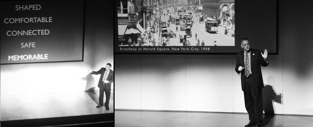
Rue St. Jean, Quebec: Shaped, comfortable, connected, safe, memorable

First, good streets are shaped. The street space is given a designed form, like an outdoor public room, with the roadway and sidewalk its floor, the buildings its walls, and, sometimes, its ceiling formed by the tree canopy.

Second, they’re comfortable. In most climates that means shaded in the summer. Street trees, and architectural elements like porches, arcades and awnings, moderate the elements.

Rue St. Jean in the evening

Third, they’re connected. They lead somewhere. The streets that feel like what Kaid Benfield calls “people habitat” are usually hooked into the larger network, linked to the rest of the town.

Next, they’re safe. That means you aren’t stressed out about getting run over by a vehicle, because motoring speed is slower by design. You’re also safer if you have what Jane Jacobs called “eyes on the street.” The safe street isn’t faced by blank walls, but by doors and windows and porches and balconies and storefronts.

Lastly, the streets where people really like to be are memorable. They make lasting impressions because beauty surrounds us and human creativity is on display, in architecture and art and signs and landscape design. An artful spatial design, with composed vistas, ratchets up these powerful impressions.

“Umbrella Sky” on Giralda Street, Coral Gables

Walkable street design: It’s #9 on my list of Town Planning Stuff Everyone Needs to Know. For more information, subscribe to the Dover Kohl YouTube channel, or read the book John Massengale and I co-wrote, Street Design: The Secret to Great Cities and Towns.     --Victor

To illustrate many of the ideas in Episode 9, we used downtown West Palm Beach's premier street, Clematis Street. Here’s a closer look at our design for its reconstruction: Safe, Slow, Curbless, Shaded, Adaptable.

WXXI Interviews Victor Dover for NPR's Morning Edition

While in town for the Reshaping Rochester Lecture series, Victor Dover was interviewed by Beth Adams of public radio station WXXI, for broadcast during NPR's Morning Edition. The subject: Street smarts.

Reshaping Rochester, created by Rochester's Regional Community Design Center, focuses on the efforts, strategies and successes accomplished by cities that face similar challenges to Rochester: downtown revitalization, preserving the character of neighborhoods and communities, creating mixed-use centers and walkable commercial districts, and enlisting community involvement.

Listen to the interview below:

Victor Dover as Virtual Keynote Speaker for the University of Iceland

This year Victor Dover will be the "virtual" keynote speaker for Reykjavik Green Days at the University of Iceland. The lecture on "Sustainable Cities and Their Streets" is going to be beamed from a studio in Arkansas onto the big screen at Háskólatorg, with Q&A across five time zones (and no jet-travel carbon footprint). 

This event will take place on Wednesday, April 2 from 6:30pm - 7:30pm in UTC and is organized in collaboration with the Embassy of the United States in Reykjavik. Please note that this is a remote lecture from the United States.

For more information click here

Reception, Talk and Book Signing with Victor Dover!

The City of Coral Gables and Books and Books are celebrating the publication of "STREET DESIGN: The Secret to Great Cities and Towns" (Wiley, 2014). The book's co-authors Victor Dover and John Massengale selected streets from Coral Gables, South Miami and Miami Beach to illustrate why good design is crucial. 

Join us Sunday, March 2, 2014 at 3:00 PM at the Coral Gables Museum, Community Meeting Room located at 285 Aragon Avenue, Coral Gables, Florida 33134

Ramon Trias, Director of Planning & Zoning, will make introductory remarks, followed by a short presentation about the book, on sale in the Museum gift shop.

For more information CLICK HERE

Victor Dover Continues Street Design Book Tour

Victor Dover and co-author John Massengale have been doing a lot of traveling to talk about their recently released book Street Design: The Secret to Great Cities and Towns. Recent lectures have taken place in Delray Beach, Florida; The University of Texas at San Antonio; CNUFL in Sarasota, Florida; Florida International University in Miami, Florida; and the Savannah College of Art and Design in Savannah, Georgia.

NEW VIDEO: A recording of Victor's lecture at the Savannah College of Art and Design on February 11, 2014 is available online at the SCAD Virtual Lecture Hall

...continued...

Street Design Book Released to Critical Acclaim

Reviews are pouring in for Victor Dover & John Massengale's new book Street Design: The Secret to Great Cities and Towns. "Authoritative... eloquent... beautifully written... generously illustrated... magnificent..." (Better Cities & Towns) and "This book is exactly what we need at this time" (International Making Cities Livable). In the transformative, illustrated guide, the authors take a closer look at streets—both old and new—to demonstrate what works and what doesn’t. The publication features more than 150 streets with illustrations and a discussion about why they are successful and how they were created. More than 500 photos and drawings (most never before published), reveal the details behind beautiful, walkable places.

...continued...

Leading Experts Contributed to STREET DESIGN


To write our book STREET DESIGN: The Secret to Great Cities and Towns,John Massengale and I traveled a lot, measured and photographed streets we admired, and waged endless late-night debates about why they were successful. Meanwhile, Megan McLaughlin, Emily Glavey, and Kenneth Garcia were indefatigable researchers, combing the literature to probe the stories behind the streets in the book’s case studies. But we also received a boost from a phenomenal group of colleagues who suggested example streets, contributed photos, or pointed us in the right directions. Twenty-two of them went on to write short essays that add greatly to the diversity and depth of content in the book, and we are extremely grateful. 

...continued...